Trove
Deliverables:
Brand Naming
Brand Identity
Visual Identity System
Brand System Guidelines
Brand Activation
Brand Naming
Brand Identity
Visual Identity System
Brand System Guidelines
Brand Activation
Behind every used phone trade in is a platform that handles the process. Apkudo, the creators of Trove, is one of the major players in this B2B market. With a desire to bring their technology directly to the customer, the idea for Trove was born. From strategy and naming, to their MVP identity system, we partnered with the Apkudo team to understand and uncover their consumer-facing brand identity.

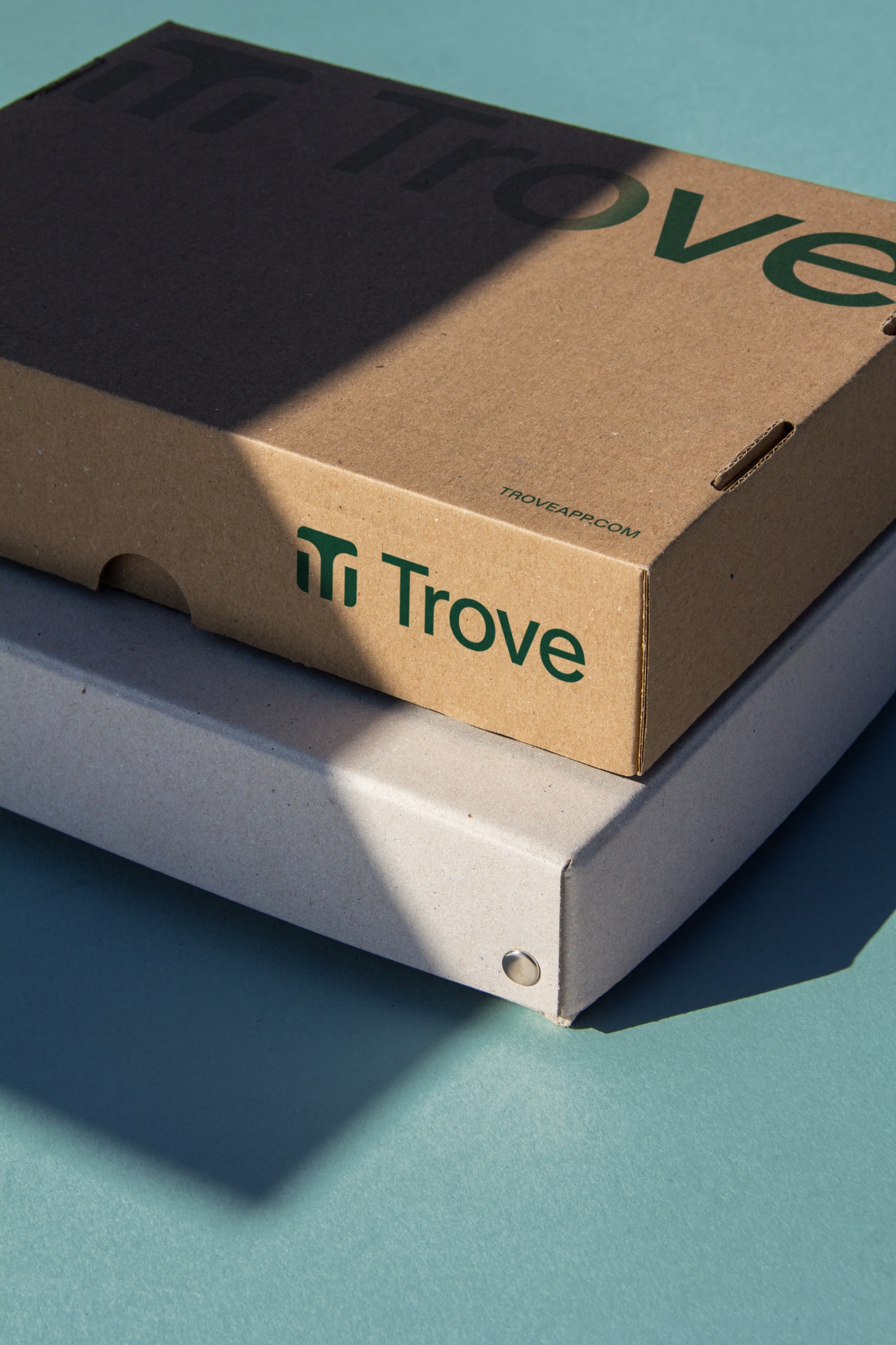
With a wide variety of applications that live in Trove’s brand ecosystem, their symbol needed to be identifiable in a variety of different applications. Their symbol abstractly shows two phones side-by-side as a visual metaphor for the trade in process. Uniquely enough, it also forms a T. Paired with a simple sans-serif, Trove’s logo embodies an appropriate, distinct, and simple result.


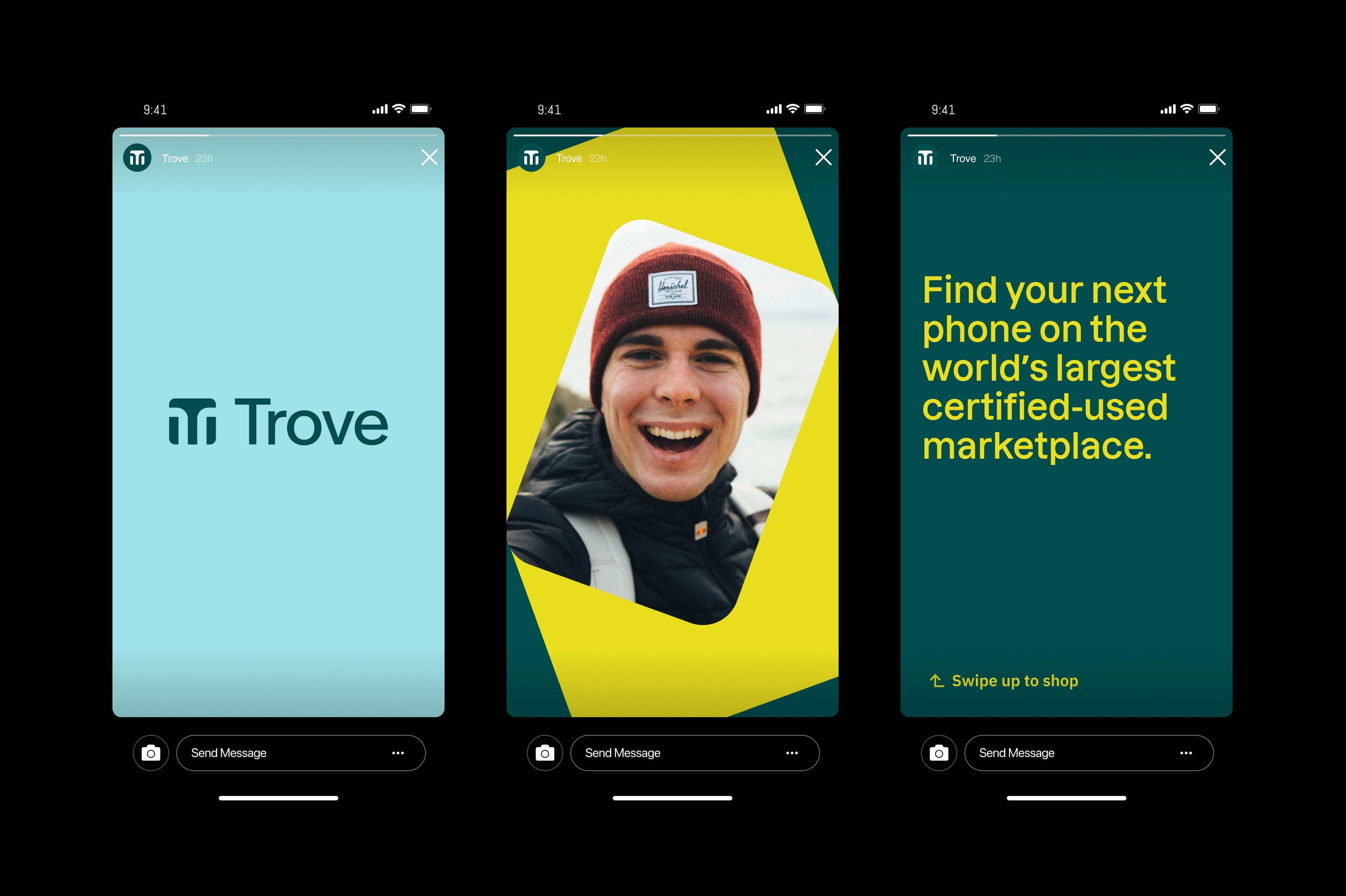
With ease-of-use in mind, Trove’s identity system embraces a dynamic color palette, simple yet versatile typographic system, and a graphic language that uses a containing shape that mimics the silhouette of a phone. Paired together, these elements can host a variety of content within various mediums that the brand will touch over time.


Thank you to BlueLabel for trusting us with bringing Trove’s brand identity to life.
While this system is the just the start, the elements found within Trove’s new visual identity system work together to create a cohesive and future-proof brand image .