Stacks
Services Provided:
Brand Identity
Visual Identity System
Brand Activation
Brand Identity
Visual Identity System
Brand Activation
Previously known as Blockstack, Stacks is an open-source network of decentralized apps and smart contracts built on Bitcoin. Essentially, it makes Bitcoin programmable. With the shift of simplifying their name, Stacks was in need of a new visual identity that was representative of their values and story, as they make progress towards creating a deeper decentralized network.


Bringing in the help of my talented friend JT Grauke, we formed a simple, distinct, and appropriate symbol that serves as the identifier for the new Stacks ecosystem.
Visually, the symbol relates to currency, while its meaning goes deeper. By using a X—a character that’s not found in the name, but found in the coin’s abbreviation—as the base of the mark, it’s formed out of two converging arrows, abstractly symbolizing hyper-connectivity.
Visually, the symbol relates to currency, while its meaning goes deeper. By using a X—a character that’s not found in the name, but found in the coin’s abbreviation—as the base of the mark, it’s formed out of two converging arrows, abstractly symbolizing hyper-connectivity.
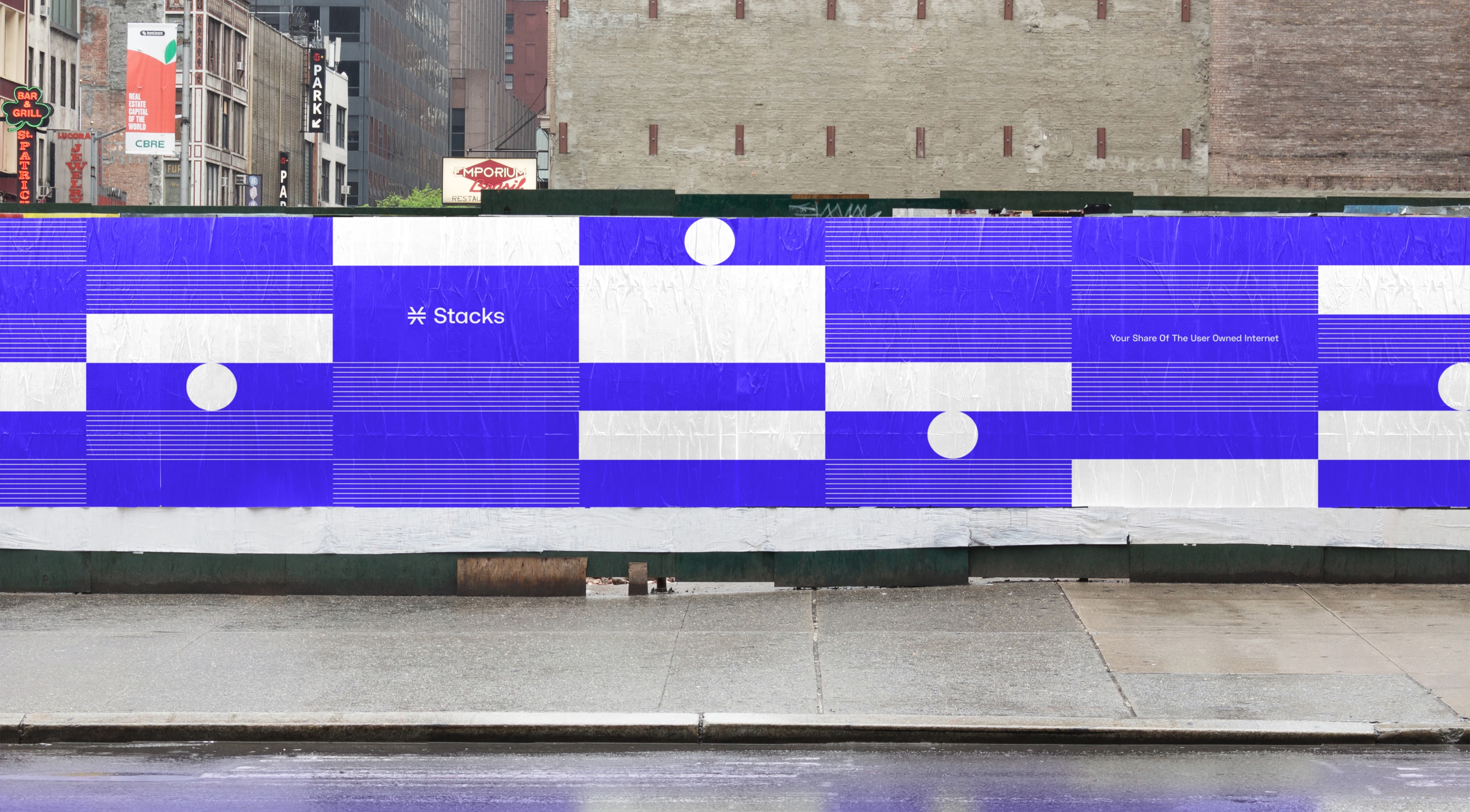
As part of our Stacks rebranding efforts, we explored how their new logo could be supported by a flexible visual identity system for their ecosystem.
One of our explorations included abstract illustrations and patterns that served as building blocks for not only the system itself, but as representation of building the ecosystem itself.
One of our explorations included abstract illustrations and patterns that served as building blocks for not only the system itself, but as representation of building the ecosystem itself.

Designed in collaboration with JT Grauke
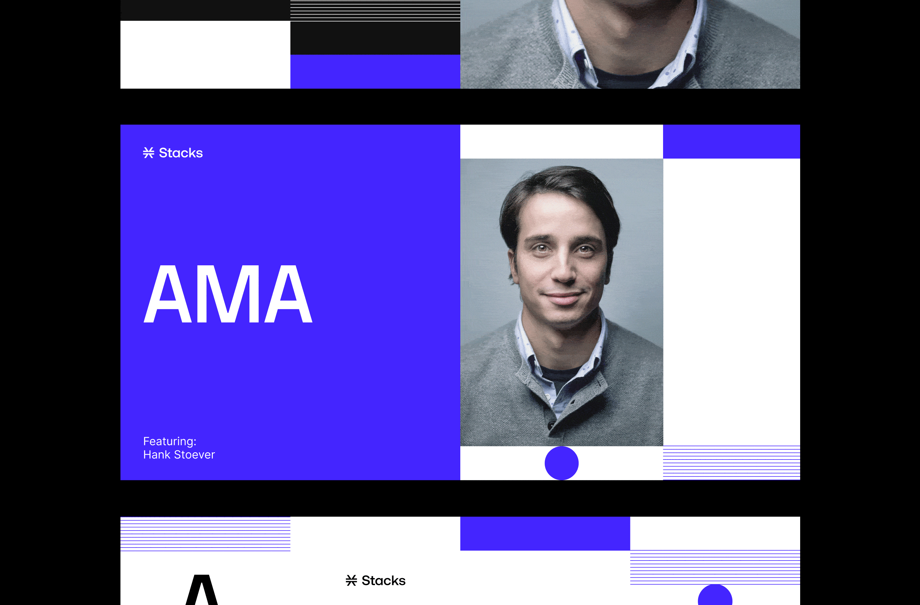
Over time, we helped inspire their visual identity system as it sits today. We collaborated with their team to provide concepts and insights into how their system could live—from typography, to color palettes, to illustrations.