Linse Capital
Services Provided:
Brand Identity
Brand Identity
Linse Capital is a growth equity firm focused on transportation, energy, and logistics technology. They needed an update to their brand identity that felt more relevant to what they do, and true to who they are.
Through our discovery process, we uncovered that one of their biggest differentiators was the deep connections that Linse creates with their investments. Their previous brand identity didn’t represent this in a clear and simple way.

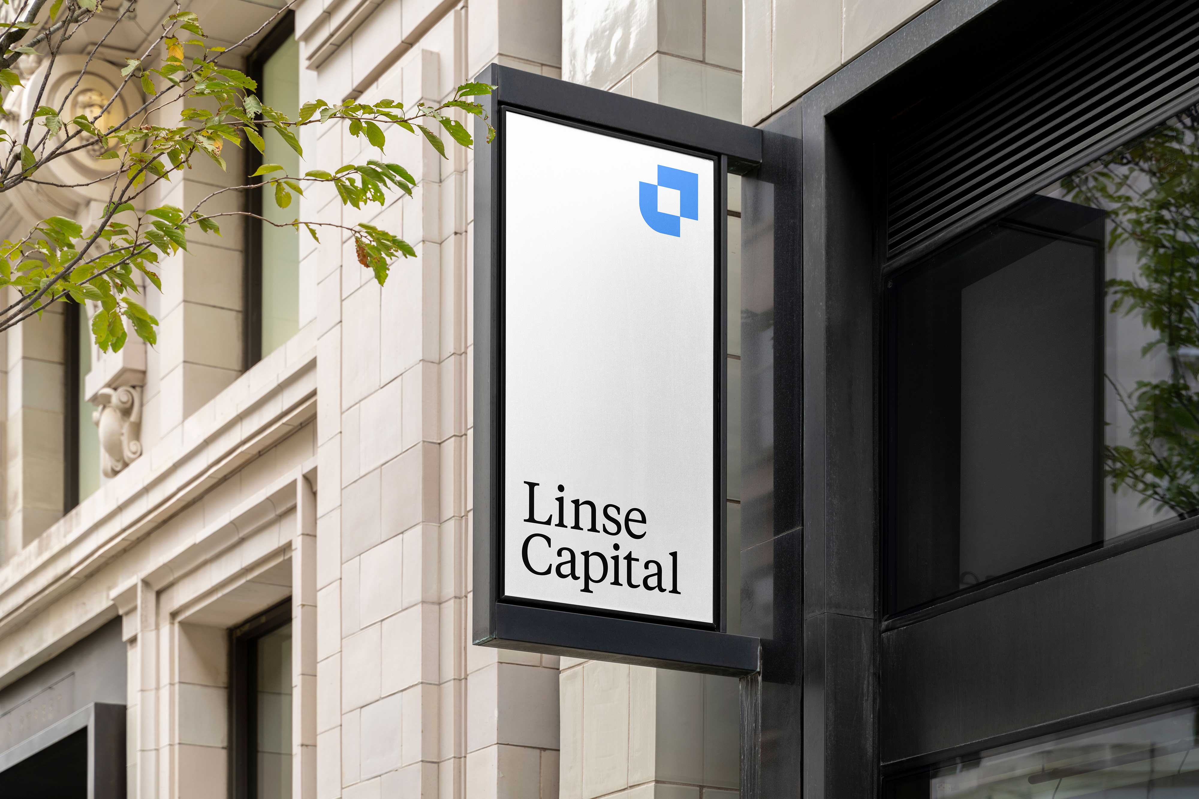
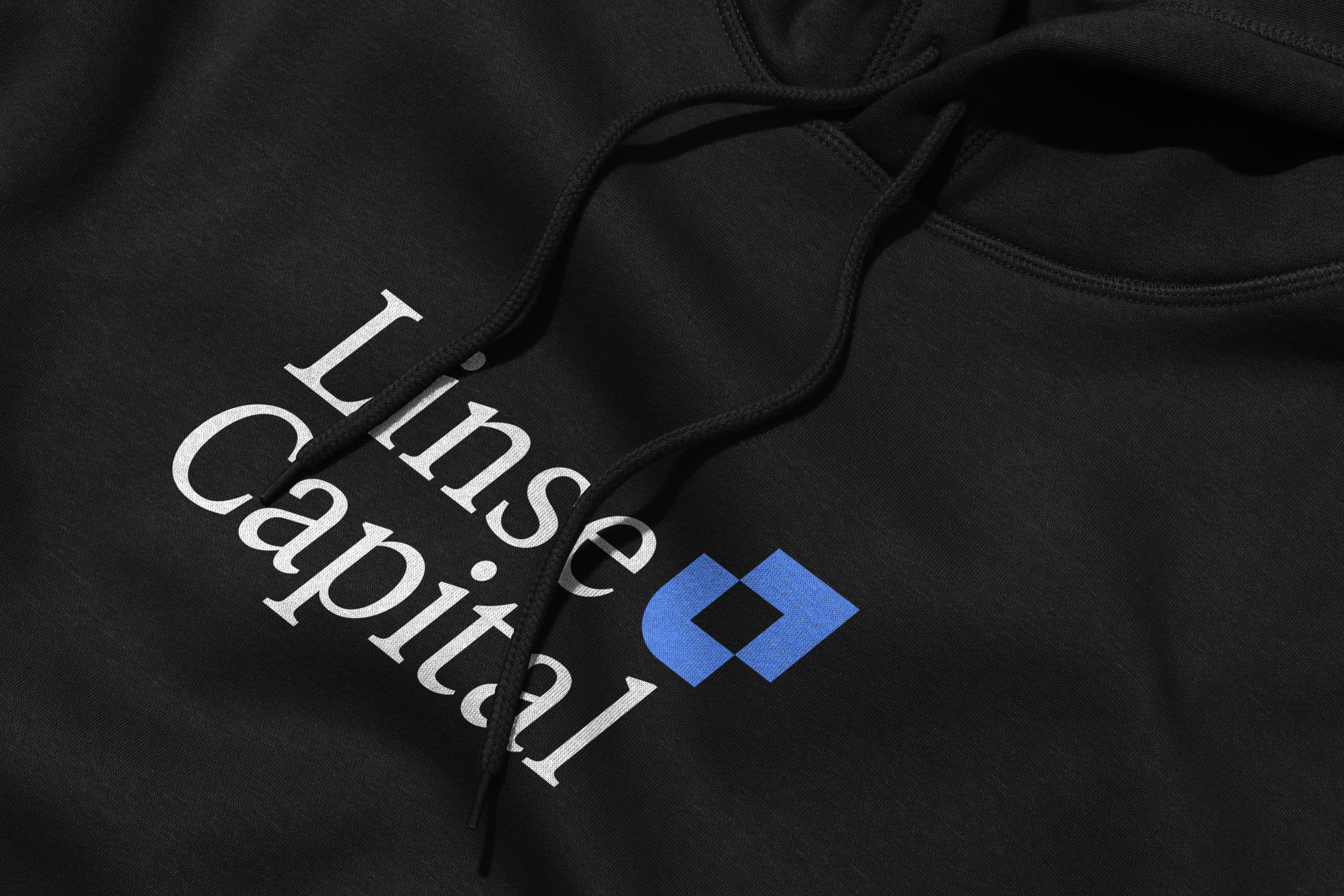
Starting from the idea of connection, Linse’s new symbol took form. A simple L connect’s to an upward arrow as a metaphor for the positive momentum that their investments create. Paired with an elegant serif wordmark, the Linse logo feels timeless while simple enough to scale across a variety of large to small mediums.