Jack Cotter
Deliverables:
Brand Strategy
Brand Identity
Visual Identity System
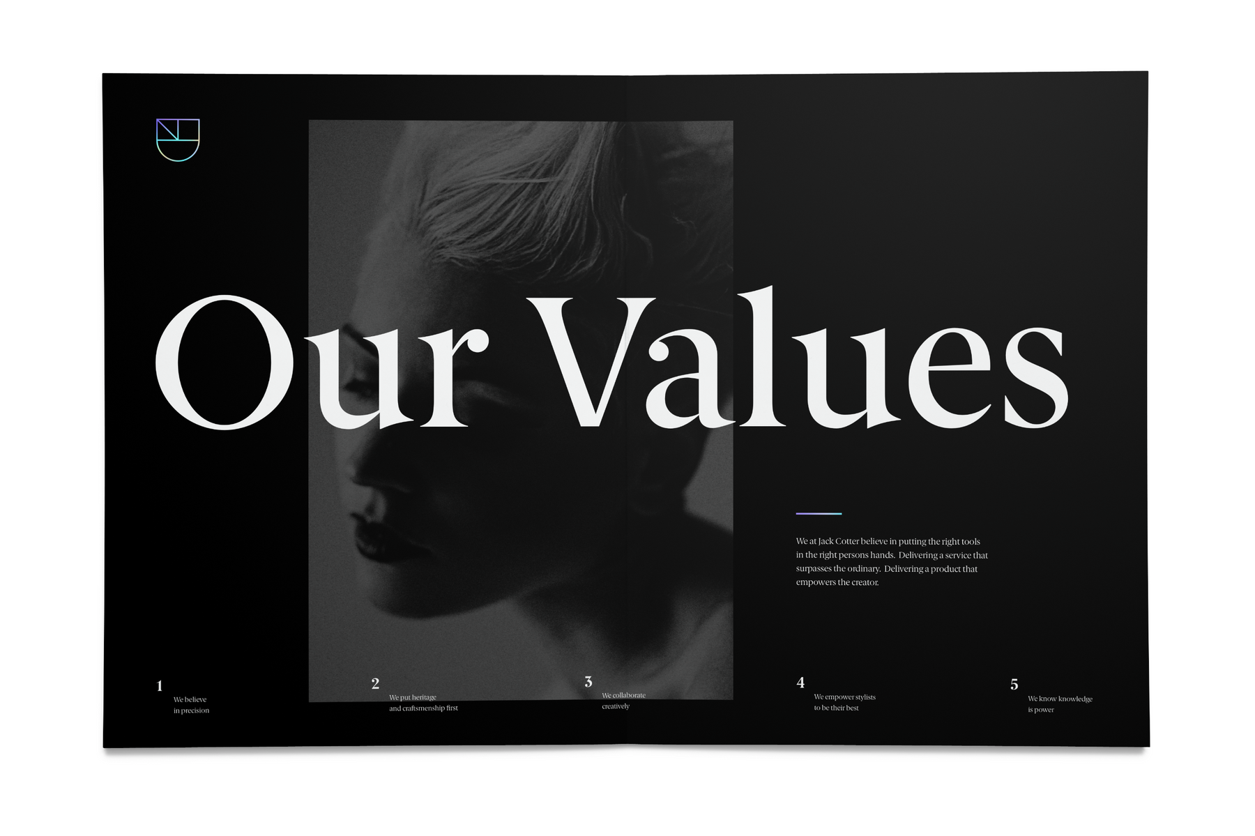
Brand System Guidelines
Brand Activation
Brand Strategy
Brand Identity
Visual Identity System
Brand System Guidelines
Brand Activation
The beauty supply industry has a problem. It’s saturated with sub par products that don’t educate their customers on how to use their products, and provide less than optimal experiences in customer service. Jack Cotter’s founder had a different vision. One that provided quality tools to practitioners in beauty, with continued education and support to their craft. With a mission rooted in caring values, the brand needed to reflect precision and education in an aesthetically minded way.
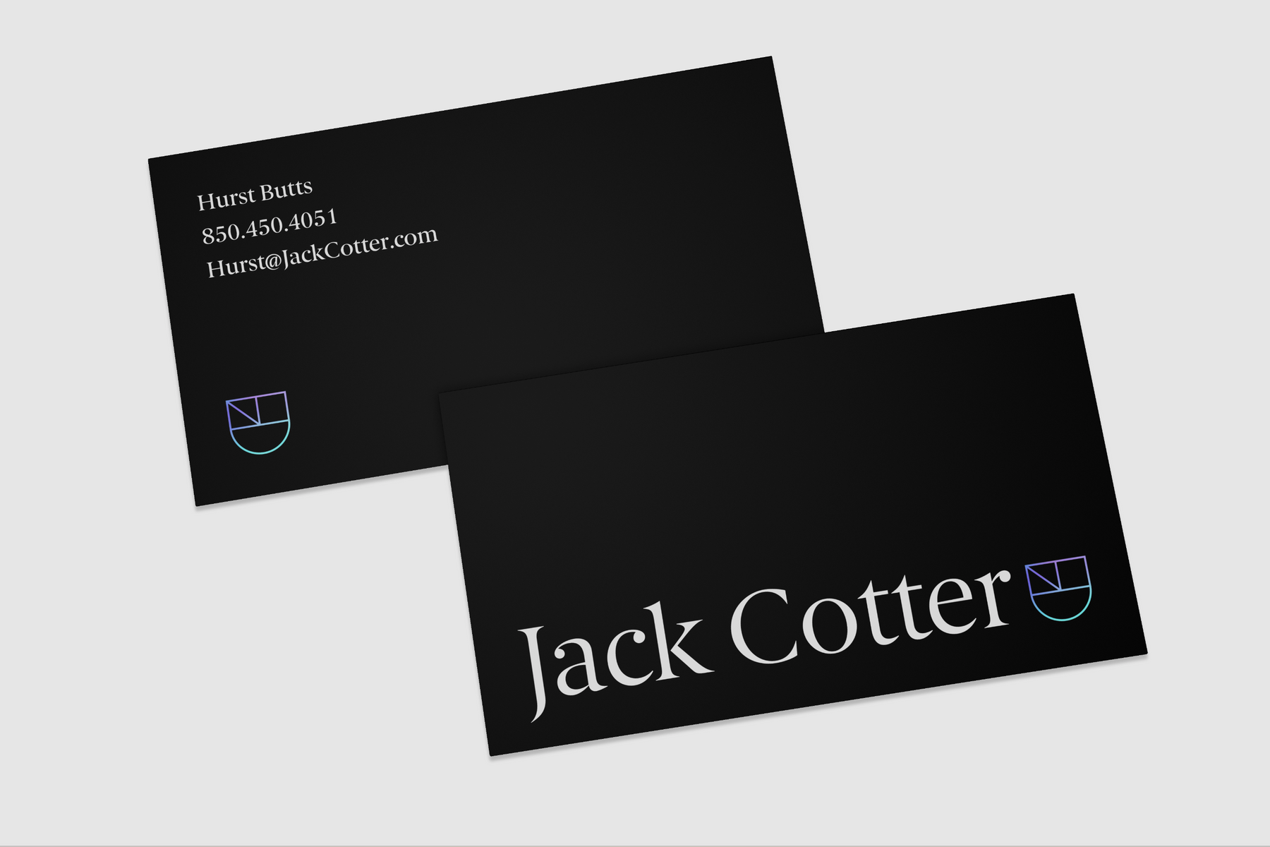
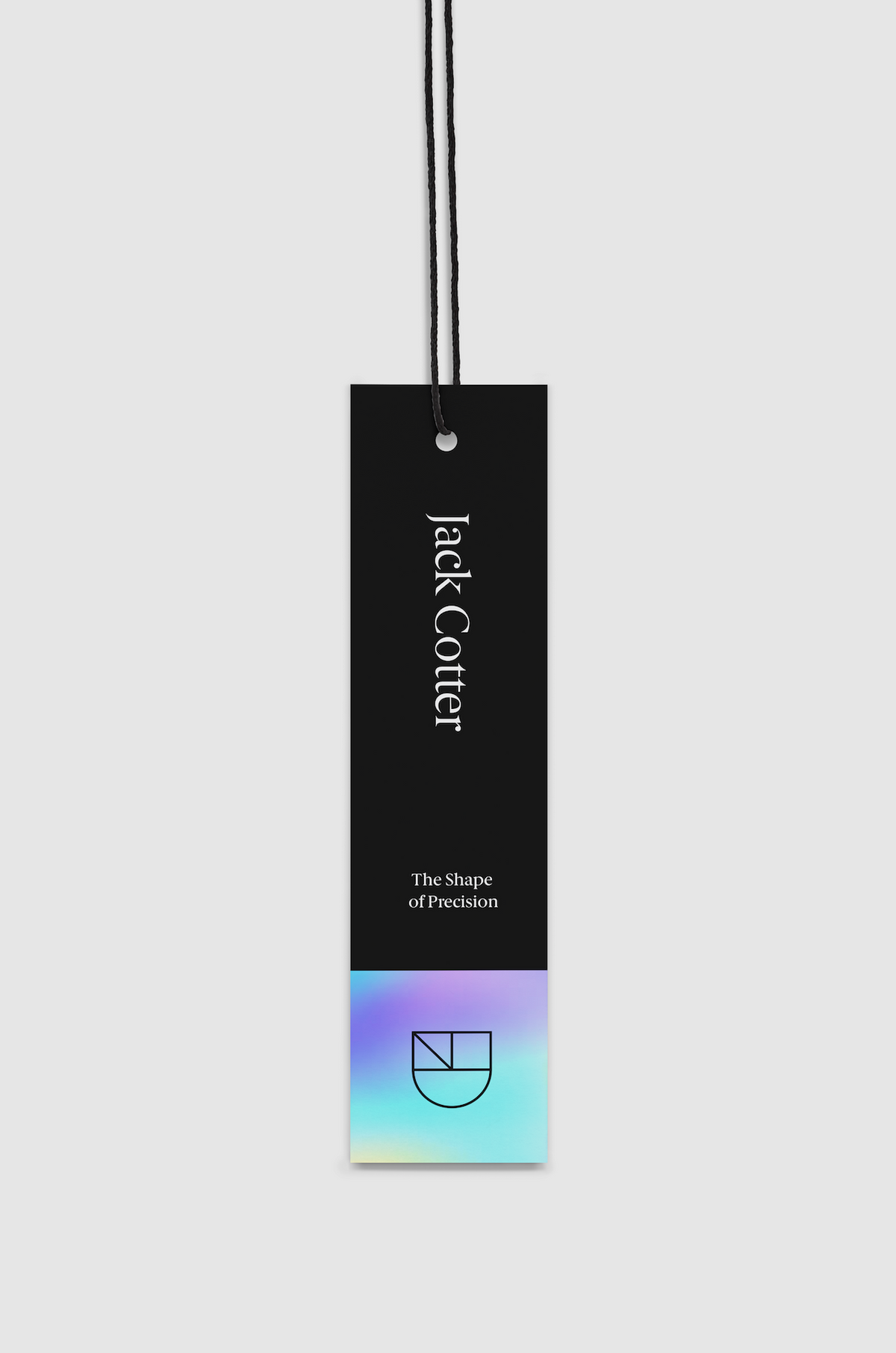
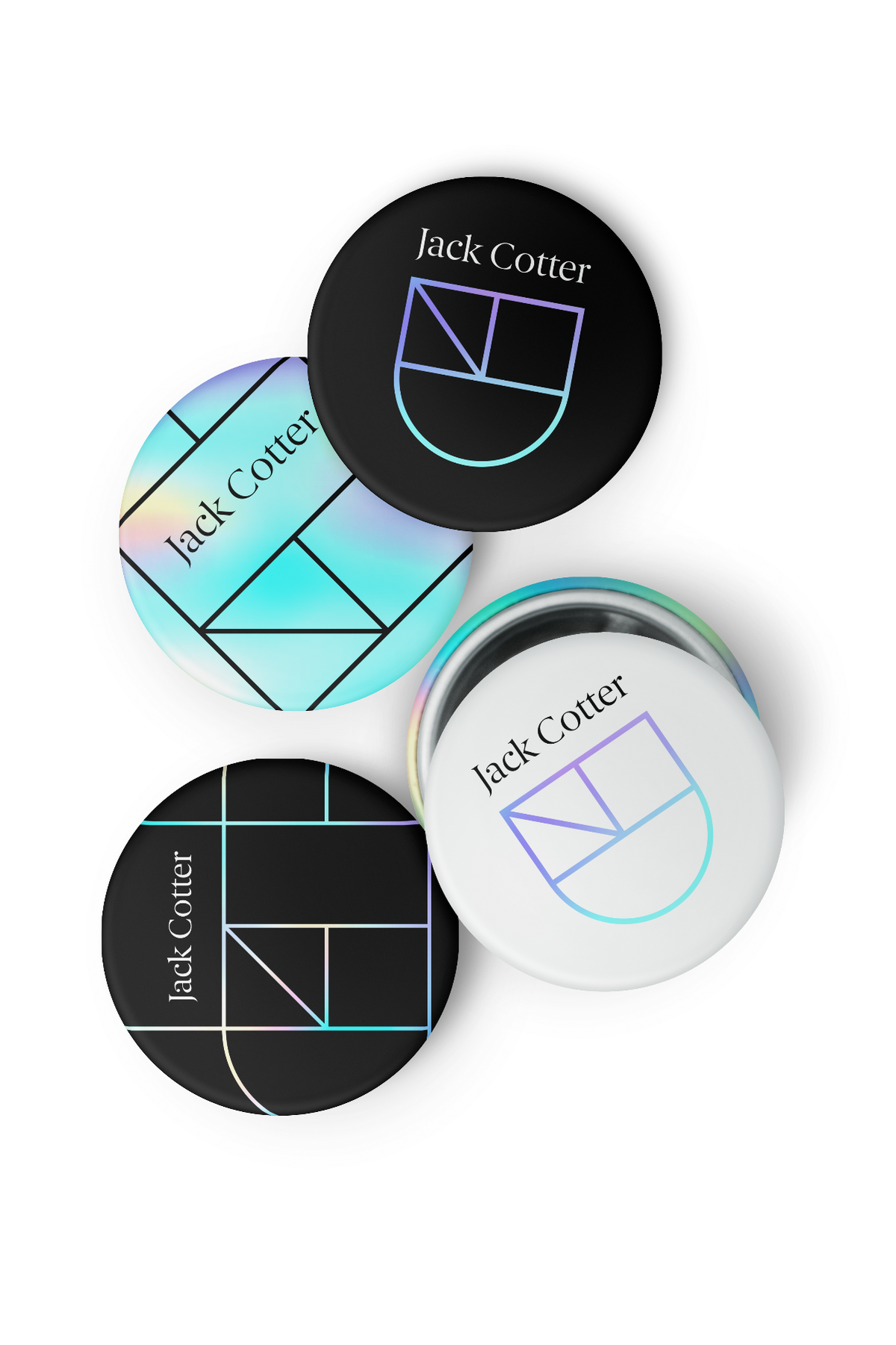
The Jack Cotter logo is formed using the 3 simple shapes used to cut hair-circles, squares, and triangles. The logo mark, using these shapes, creates a crest-standing for heritage and craftsmanship. It’s the promise of quality-while also subtly forming a J from the brand’s initials. The visual appeal of the logo contrasts a modern & precise, yet classic approach by using thin, geometric lines in the brand mark, while the logo type is set in a modern serif font.
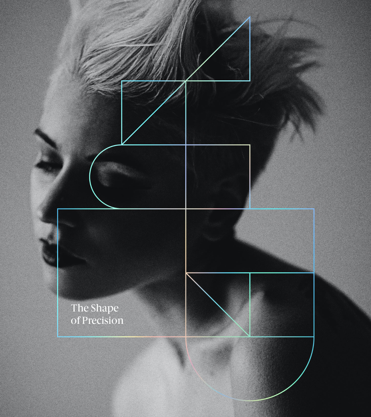
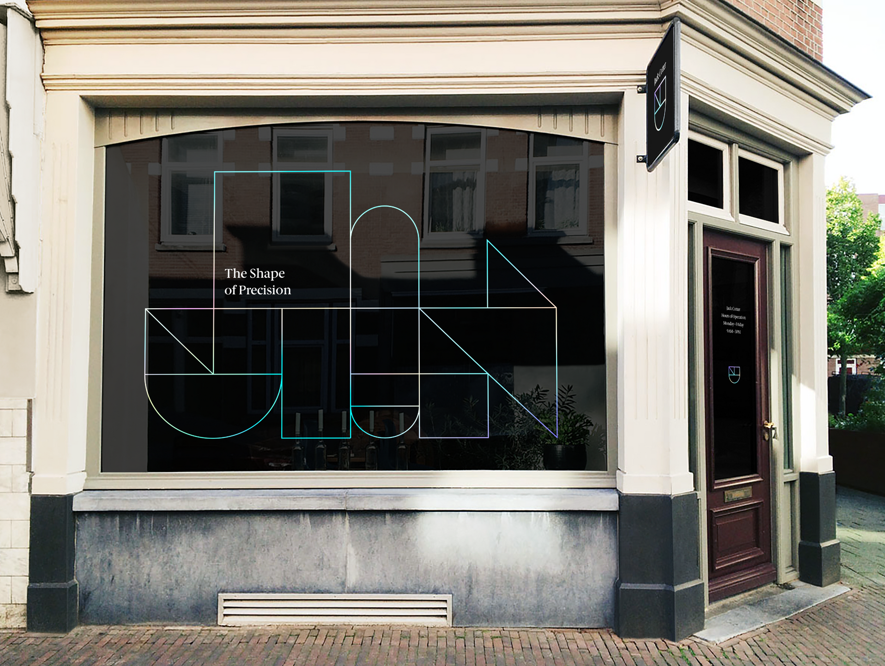
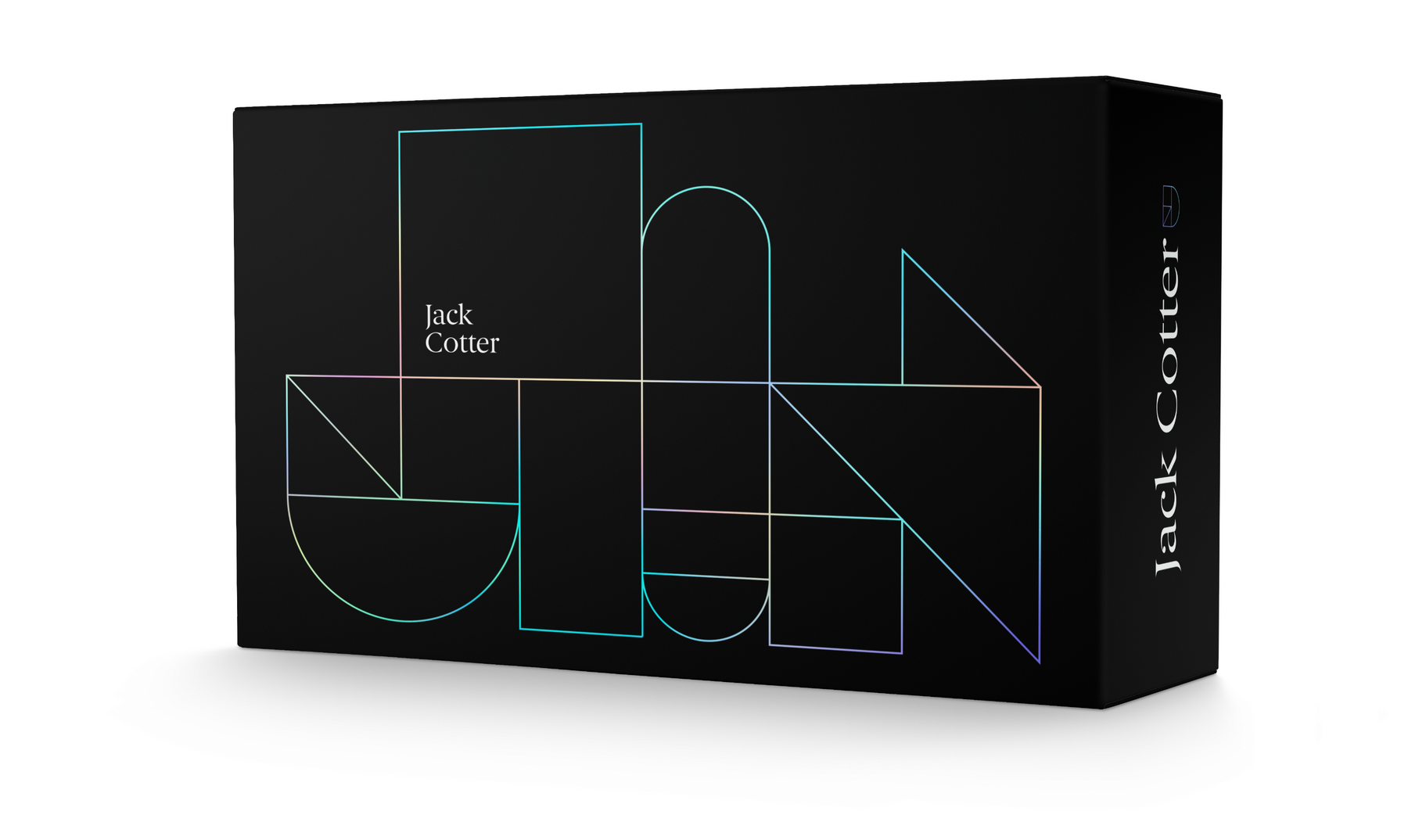
The visual identity system further emphasizes the logo by visually building the shapes into an eclectic pattern. These shapes symbolizes the process of building a haircut. The colors found within the logo mark and brand pattern abstractly portray diverse hair colors and styles. With all of these components together, the Jack Cotter visual brand positions the company to be a leader in their industry.