GreenPlaces
Post Project Successes:
$18M Raised
Services Provided:
Brand Strategy
Brand Positioning
Verbal Brand Identity
Visual Brand Identity
Visual Identity System
Brand System Guidelines
Brand Activation
Website Design
$18M Raised
Services Provided:
Brand Strategy
Brand Positioning
Verbal Brand Identity
Visual Brand Identity
Visual Identity System
Brand System Guidelines
Brand Activation
Website Design
Corporate sustainability is complex. It’s also imperative–for employees, customers, investors, and of course, our planet. That’s where GreenPlaces comes in. They make being a sustainable business straightforward, and even rewarding. Having out grown their previous identity, GreenPlaces needed to clearly position themselves as the leader for corporate sustainability efforts.

Brand Strategy & Positioning
Leading with purpose, GreenPlaces’ needed to position themselves authentically in a market that’s audience is under-informed and afraid to make the wrong move. Partnering with This is Martha on Strategy and Verbal Identity, we focused on positivity and the impact we can make towards the future: Bringing our climate-positive future to light.
Leading with purpose, GreenPlaces’ needed to position themselves authentically in a market that’s audience is under-informed and afraid to make the wrong move. Partnering with This is Martha on Strategy and Verbal Identity, we focused on positivity and the impact we can make towards the future: Bringing our climate-positive future to light.


Visual Identity
A logo inspired by the future
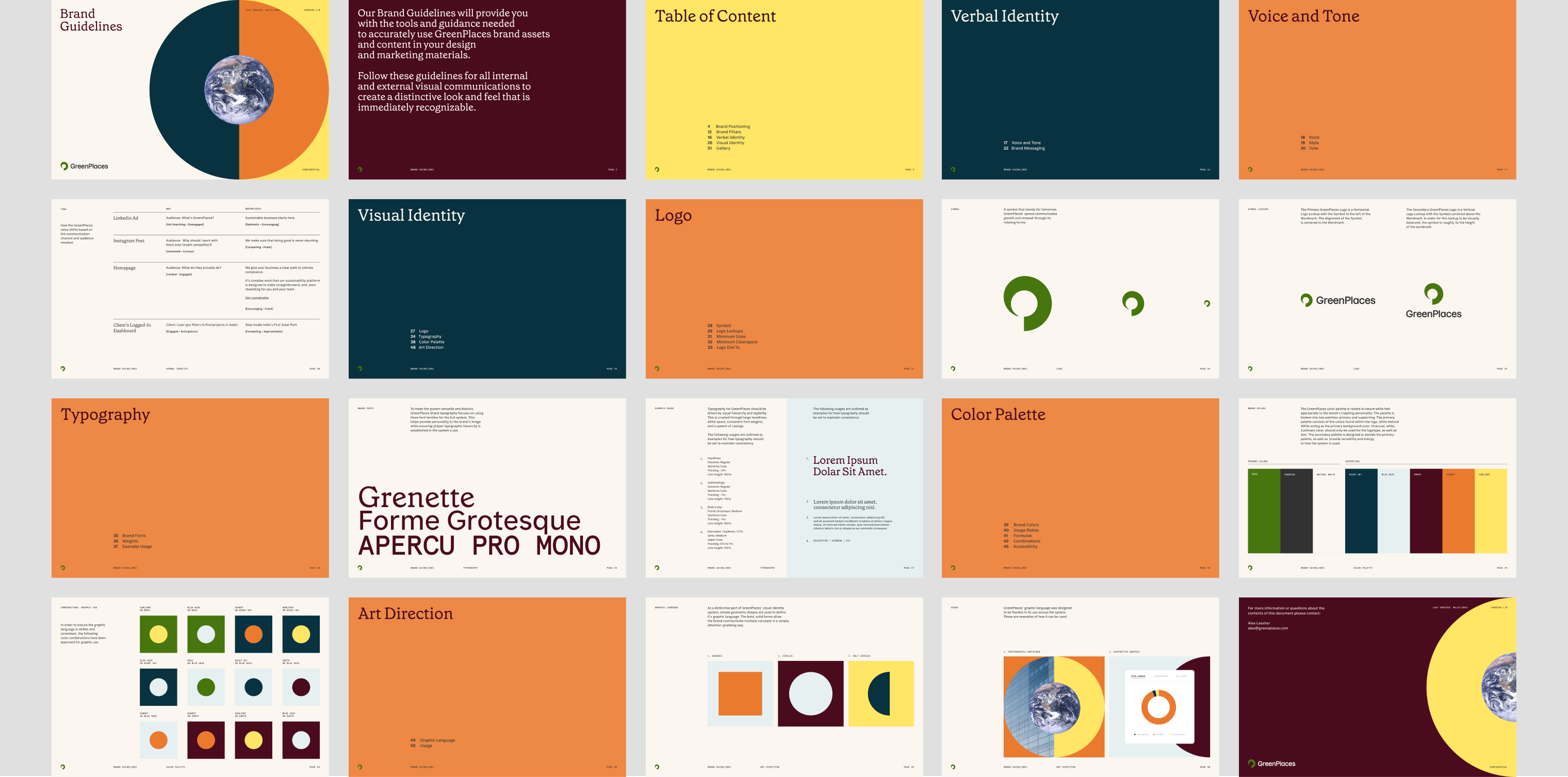
We started by reimagining the GreenPlaces logo. The new symbol stands as a visual representation of renewal, while it’s form creates a lowercase g, and even p in the negative space.


Visual Identity
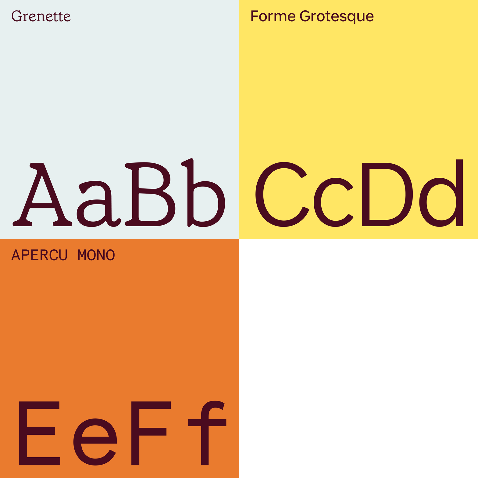
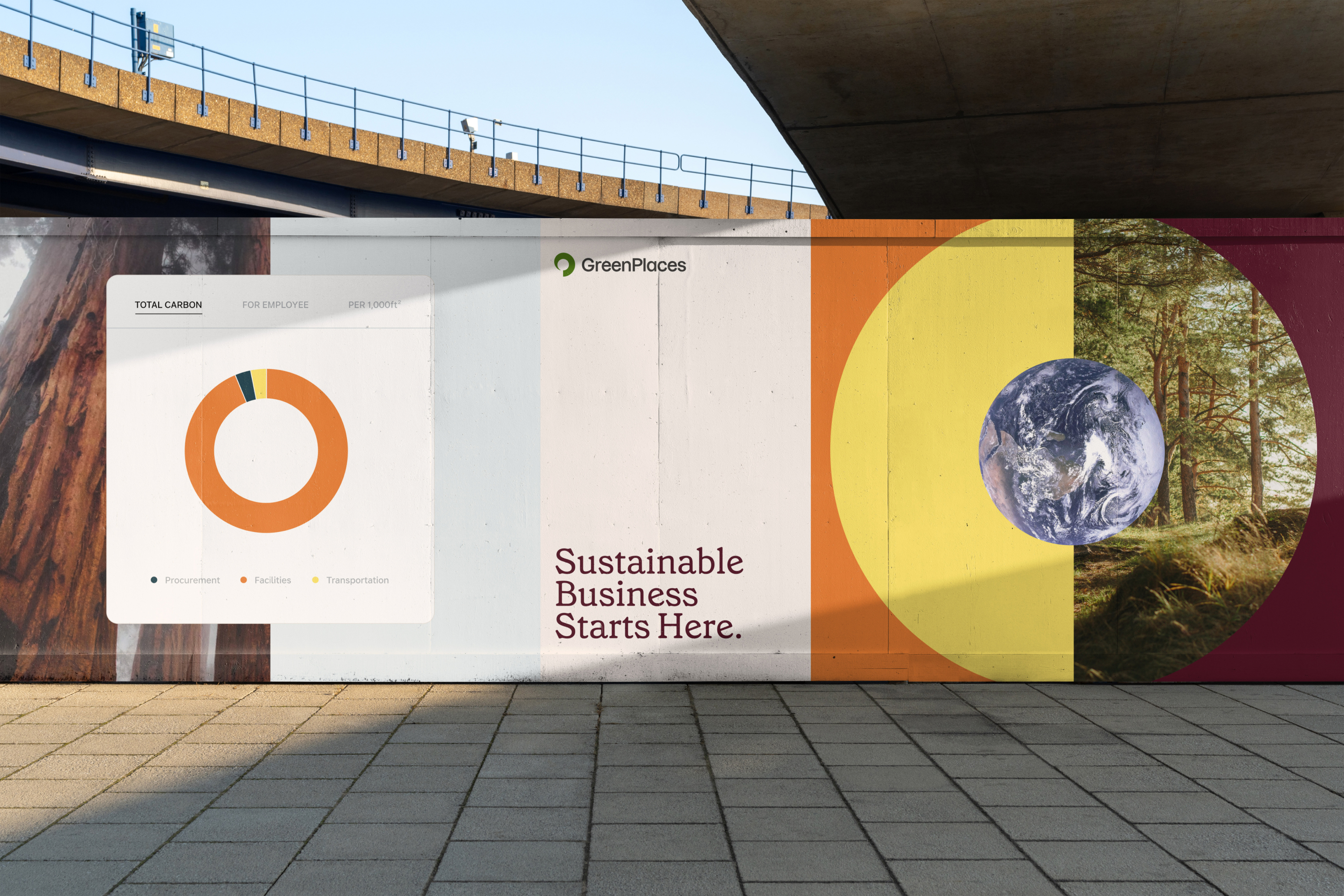
The core foundation of GreenPlaces brand identity are visual elements that stand for positivity—a bright yet grounded color palette, approachable type, and a system of radiating shapes that contains and supports various forms of content like photography and dashboard UI.
A visual language with flexibility at its core
The core foundation of GreenPlaces brand identity are visual elements that stand for positivity—a bright yet grounded color palette, approachable type, and a system of radiating shapes that contains and supports various forms of content like photography and dashboard UI.


Website
Bringing the brand to life, digitally
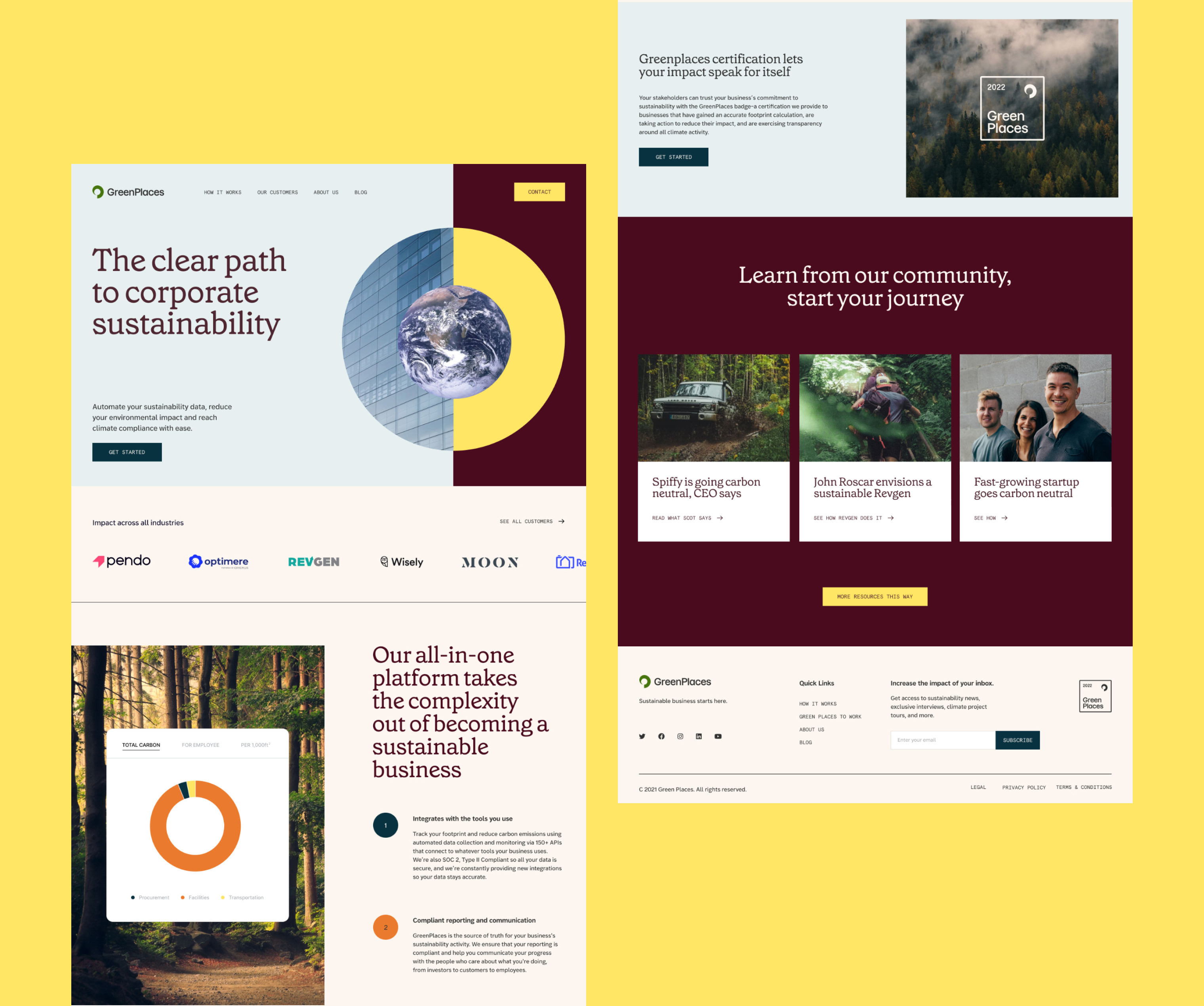
Following the new principles and tools found within their brand identity, GreenPlaces’ new website took form. We helped design and set direction for the GreenPlaces website, and ensuring all elements were scalable for responsiveness and accessible by excelling W3C standards.


Results
Measurable impact, beyond the planet
Just months after their rebrand, GreenPlaces raised 4x the amount of their initial seed round, seeing an instant return on in their investment.
“I love the way you walk through the work. It’s like sitting down for a masterclass. I’ve been through enough of these where people just throw it down in front of you and ask what you think, but you really explain why you made the choices you did and teach us about design along the way. I’m always learning something.”
Alex Lassiter
Founder & CEO, GreenPlaces
Produced in collaboration with This Is Martha.